Hello All,
Today we’re launching a new logo along with our new site – online presence, as we start to refresh our look in general. We loved our old logo, and look, and know many felt the same and we respect them.
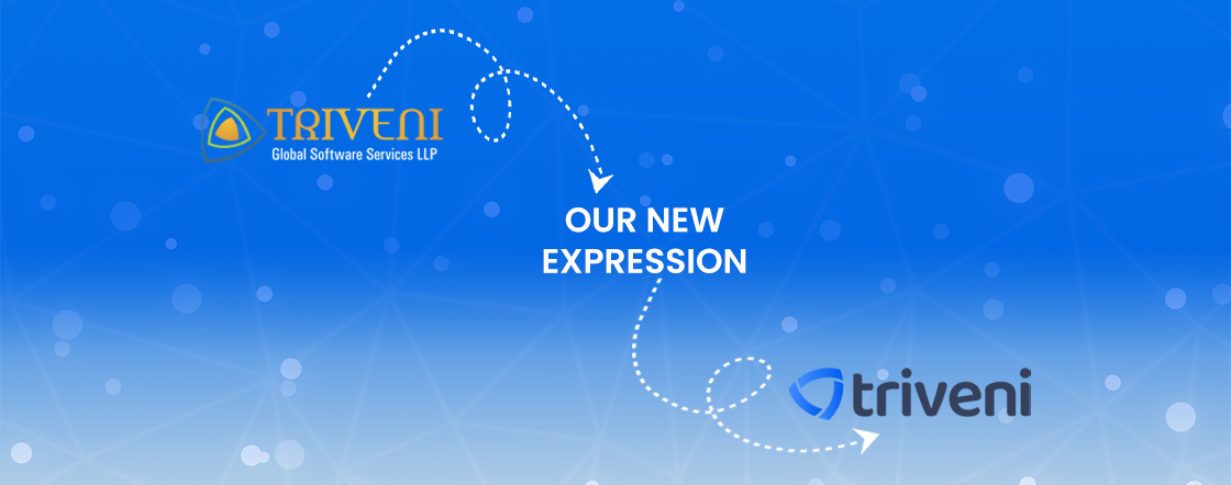
Here we are to explain why we decided to evolve it.
We are Triveni. For us, Triveni is the confluence of flows – ideas, strategies, people, process and technology. We are a service based – offshore software development company and our team always believes in bringing innovation to software we build.
The change in logo is not for the sake of change. Our first logo was created before the company was launched. It has five colours and sometimes if it is placed on any color other than white or at the wrong angle or to another degree, it looks weird.
Same time, we want our client to feel like Triveni they are working with is up to date. Logo refreshes show that you are evolving and changing to keep up with the modern world. We don’t want to seem like we are stale and unwilling to change. 🙂
We want a logo more simple, distinctive.
Our creative and core team spent great time throwing an idea, brainstorming it and came up with a simple look and feel.
It uses a simpler color and, we believe, is more focused – refined, but still contains the spirit of the original. Our core values remain the same and we are just changing the brand identity to refresh our look and feel. It’s an evolution, and one that can scale easily, and work better, in many more places.
Over the next few weeks, you’ll see all the other visuals around Triveni aligning around this new logo direction: on the website and in social media. It’s still us. We’re still Triveni. But more consistent and, we hope, more instantly recognizable.
Thank you.
Mr. Rajnikant Rana